
Mitchell & Butlers
background
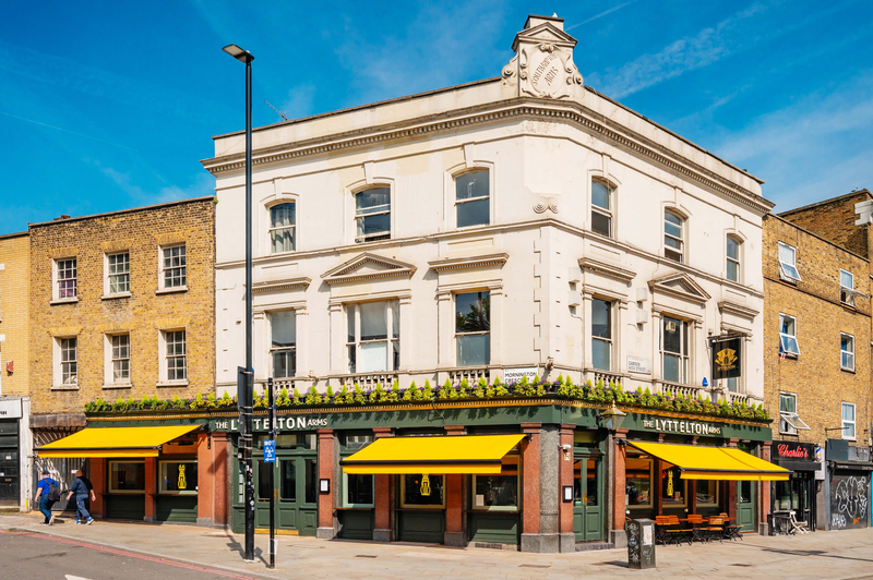
In 2010 Mitchell & Butlers we ‘rebranding’ a site in Mornington Crescent. The incumbent brand was having troubles and had developed a bad reputation as a pub.
The rebrand, was to be one of the first new ‘Castle’ entities, with a focus on quality gastropub food and an eclectic feel, design and music policy to clean up the past reputation and firmly put it to bed.
The new ‘Castle’ rebrands also enabled the pub General Manager and his team to put their own individual stamp on the venue, getting away from chain brand look and allowing each site to reflect its own individual character on there area.
strategy
We whiteboarded with the General Manager a combined strategy of music policy and the outlooking company profile.
Music Policy
To book established acts to perform in our pub. The bigger the name, the greater the advertisement of the change in venue. By employing a well sought after talent, to play in the pub, with no entry price, brought the artists themselves into endorsing the new brand even by de facto.
Company Profile
-logo
A balance of cool and quirky – with fresh and trusted cooking, for both the music policy and food sales was decided. We whiteboarded with the venue surrounding colourful and vibrant no descript image background – and placing a homely slightly independent looking typographic. We quickly wireframed some examples over as we decided on the type.
We decided to reuse a classic and well heeled font here, with the background creating the creative balance. The background also allowed us to move and change the logo to encourage the independent theme.
-programmes
We needed the printed listings flyer to have substance to portray our new profile – a flimsy cheap leaflet wouldn’t do. So we whiteboarded some folded flyer designs with the management.
The paper used would be of a medium heavy gsm – for quality and compactness – whilst using a recycled pulp paper for the edginess.
Sorry, the comment form is closed at this time.